

Dashboards
Dashboards are the overview screens under Dashboards, split across Traffic, Applications and Conversions. Every tab shows the date range you pick, and can be filtered on Department, Location and Job Opening.
A dashboard shows what the rest of the platform recorded. It puts promotion spend and applications side by side for the same period, which is how it calculates Cost per Application and Avg. Cost per Hire.
Relations
- Application — counted per job opening and per source.
- Conversion — the Conversions tab shows what each conversion counted.
- Career page — its visits are what the Traffic tab counts.
- Promotion — what promotions cost is what every spend card shows.
- Job opening — a filter on every tab, and one way results are split up.
Setting the period
To see your numbers for a different date range, set the period. It applies to every tab.
- Open Dashboards and select the tab you want.
- Select the date range and pick a preset, or pick your own dates.
- Select Apply.
The cards and charts now show that period, and each card shows how it changed compared to the period before.
Traffic
The Traffic tab shows who visited your career page.
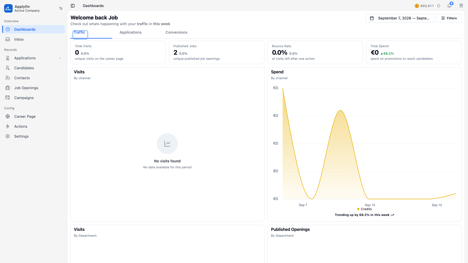
Its stat cards are Total Visits (unique visits on the career page), Published Jobs (unique published job openings), Bounce Rate (of visits left after one action) and Total Spend (spent on promotions to get applications).
Below them are four charts: Visits by channel, Spend by channel, Visits by department, and Published Openings by department. The first two show individual sources once you filter on a department or a job opening.
Applications
The Applications tab shows how many visitors applied.
Its stat cards are Total Applications (people applied for a job), Average per Job (applications per published job), Conversion Rate (of visits applied for a job) and Cost per Application (spent on promotions per application).
Below them are Applications and Spend, both by department or by job opening, and Metrics and Spend, both by source type or by source. The metrics table has a column for Source, Visits, Avg. actions, Avg. time, Applications and Conversion, with a Total row underneath.
Conversions
The Conversions tab shows the funnel your conversions counted.
Its stat cards are Total Applications (entered the funnel), Hired (applications that got hired), Avg. Time to Hire (from application to hire) and Avg. Cost per Hire (spent on promotions per hire).
Reading the funnel
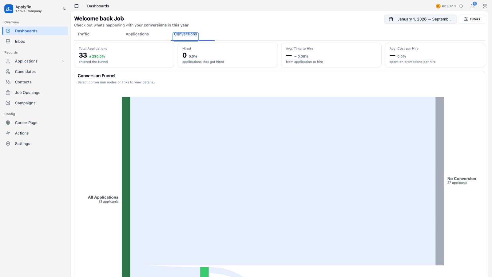
To see why applications moved to a stage and how long it took, use the funnel.
- Open Dashboards and select Conversions.
- Select a node in the Conversion Funnel, or a link between two nodes.
- Read Reasons for that node beside it.
The reasons chart now shows why applications moved there, and the time chart shows how many days it took, as a Min, an Average and a Max.